The County of San Mateo has an Open Data portal based on the Socrata Open Data Cloud. Socrata is a powerful data visualization tool allowing average citizens to generate custom reports, charts and maps. The power of Socrata can be demonstrated by your creating your own custom data map based on Seattle, WA's Fire 911 real time call data.
In 5-10 minutes you can create a custom map. It does not require any specialized knowledge of computers, programming or databases. Every thing is point and click choices.
Visit the Seattle, WA Public Safety Open Data portal
Go to the Public Safety page of the Seattle Open Data Socrata site:
https://data.seattle.gov/browse?category=Public+Safety
This is the "Catalog" of data sets, reports, charts and maps the Public Safety department has chosen to publish.
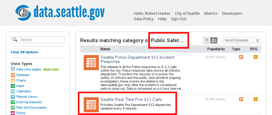
Select the "Seattle Real Time Fire 911 Calls" Dataset
Click on "Seattle Real Time Fire 911 Calls" Dataset
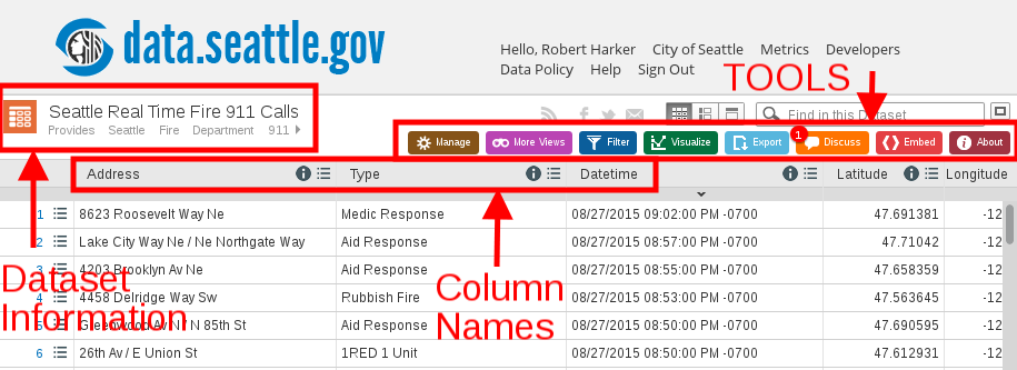
This is Seattle's real time data feed from their Fire 911 call center. It is published as a Socrata dataset (set of data).
In the upper left part of the window you should see an orange dataset (calculator) icon and the dataset name "Seattle Real Time Fire 911 Calls". This is followed by rows of call data.
Each each call has:
"Address"
Incident "Type"
"Datetime" time stamp
"Report Location" geographic Long/Lat coordinates
"Incident Number"
Looking at the rows of data in the table is boring.
My personal reaction is "so what?"
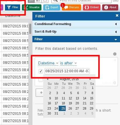
Filter The Data Set To Limit Number Of Data Points
If you scroll down to the end (bottom) of the table you will see there are tens of thousands of rows of data. Displaying this number of data points is confusing and causes performance problems (slow loading of the map). We want to limit the data in the last two days so we have a reasonable number of data points (dots) on the map.
Next to the dataset name are half dozen colored buttons. We are going to "Filter" the data.
|
To make these instructions easier to understand:
There is now a right hand "Filter Column"
A filter box is added which has:
S: Column to filter defaults to 1st column. "Address" in this case
S: Conditional defaults to "is"
C: Click on the "Test value" box, You should see the Socrata B&W bulls eye with a rotating red pie wedge. Socrata is thinking Scroll down the list of records. There should only be a few hundred now We could have also filter for records from one date to another or of a specific time. |
|
But still, the data is a table of rows of data.
Boring
Start Making The Map
C: Click on the green "Visualize" button in the tool bar.
S: The drop down tool column changes and now is visualization tools
C: Click on light green "Map" drop down menu in the right side bar.
S: Light green becomes green and you see a drop down column to configure your map.
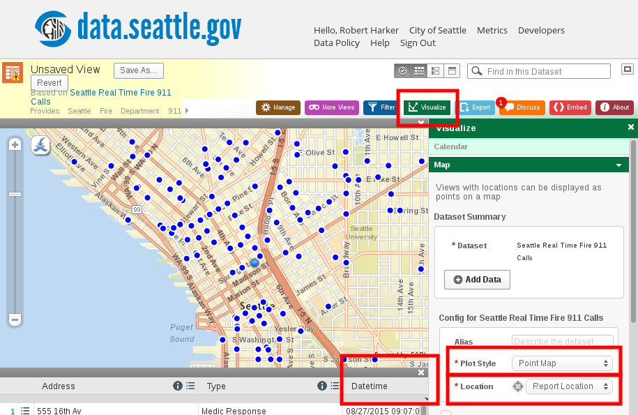
In "Config for Seattle Real Time Fire 911 Calls":
C: Click on "Plot Style"
C: Select "Point Map"
C: Click on "Location"
C: Select "Report Location"
Scroll to bottom:
C: Click on "Apply"
You should see the Socrata bulls eye working
Your view will change to a map with data plotted
If you are seeing a world map:
Click on the "Locate Me" button in the upper right corner
It is a stylized X with a curved arrow pointing down. Kind of looks like a campfire
Enter Seattle, WA
Your map should recenter around Seattle
If you want to get rid of the table below the map: C: Click on the X above the Datetime column in table
Zoom into the map until you can see streets
Caution: Do not click the zoom too many times in a row. 2 maximum. Each click submits a separate request to Socrata. Too many and the app crashes and you are dumped back to a default view
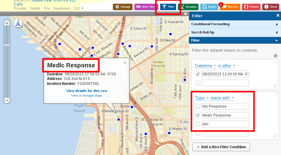
Add Information To Data Point Flyovers
A "flyover" is a dialog box that pops up when you click on a data point.
Click on one of the data points
The flyover has a link to the table row but no data
Boring
Make the flyover more useful by displaying the data
C: Click on the green "Visualize" button in the tool bar.
In the "Visualize" column on the right look at "Config for Seattle Real Time Fire 911 Calls"
Below the box is a check box: "Advanced Config for Seattle Real Time Fire 911 Calls"
Click on it
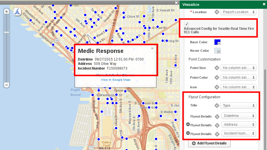
You get a new set of options:
Click on "Title"
Select "Type"
Click on "Flyout Details"
Select "Datetime"
Click on "Add Flyout Details"
Select "Address"
Click on "Add Flyout Details"
Select "Incident Number"
Scroll to bottom:
Click on "Apply"
You should see the Socrata bulls eye working
Now when you click on a data point, the flyover has interesting information.
Limit the types of data